Orchard Harvest 2026 Early Bird tickets, exploring Orchard Core's Next-Gen Visual Layout Editor Feature - This week in Orchard (05/06/2026)
Explore a powerful new module for Orchard Core by Nick Jackson that lets you visually organize content type editor fields and parts into tabs, cards, and columns via an intuitive drag-and-drop interface, with zero coding or placement.json editing required!
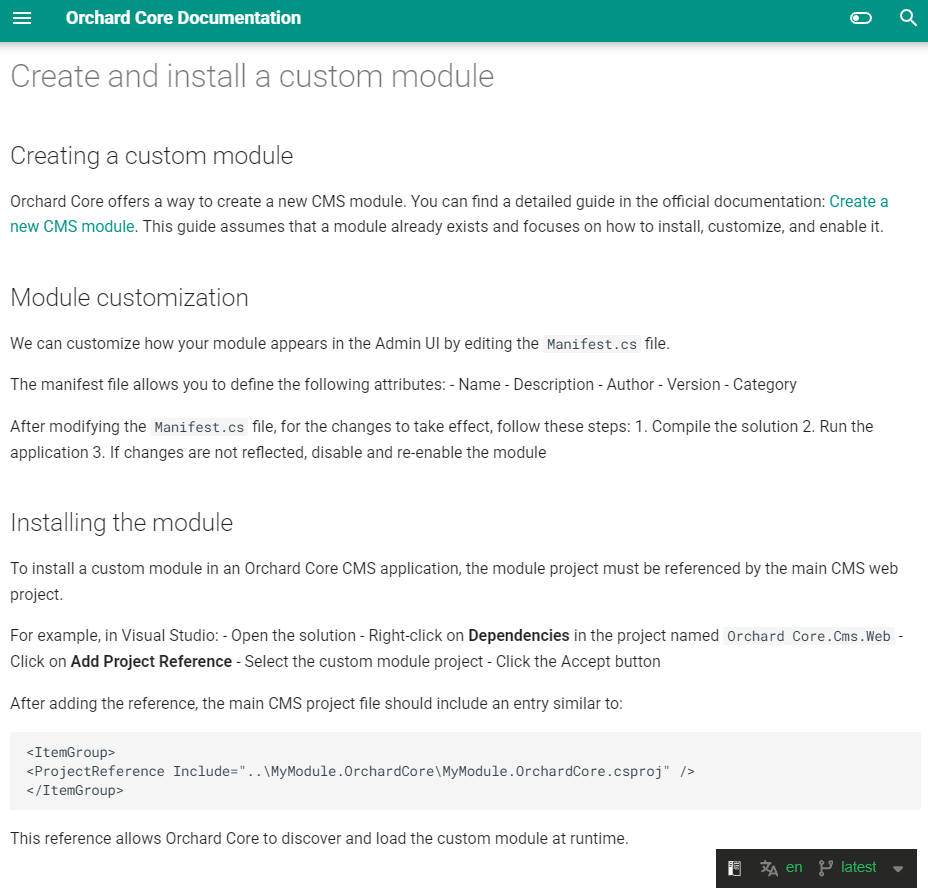
Did you know that with just a few configuration tweaks and a single project reference, you can extend Orchard Core CMS with your very own custom module that is fully integrated into the admin UI and discoverable at runtime? Check out this brand-new guide by Manuel Tamayo Montero!
We're excited to open registration for Orchard Harvest 2026! Secure your spot today for the early bird pricing and get ready to level up your skills!
Orchard Core updates
How to create and install a custom module?
Did you know that with just a few configuration tweaks and a single project reference, you can extend Orchard Core CMS with your very own custom module that is fully integrated into the admin UI and discoverable at runtime? Thanks to Manuel Tamayo Montero, this guide in the Orchard Core documentation reveals the simple steps that most developers overlook when trying to get a custom module up and running.
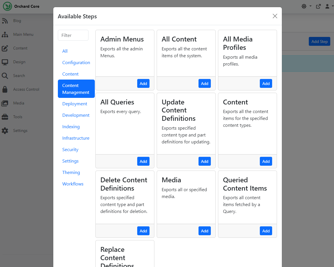
Category filtering for Deployment Steps
If you have the Workflows feature enabled, you can let users visually implement business rules using flowchart diagrams. Whenever you add events or tasks to your workflow, the modal organizes them into categories, and you also have a filter to find the next executable step more easily.
And this is a nice, helpful experience for users, so why don't we have it for the deployment steps too? Mike Alhayek thought that the same UI could be helpful when adding Deployment Steps to Deployment Plans. To check it out, head to Tools -> Deployments -> Plans and click on the Add Deployment Plan button. Give it a name, then add steps to your plan. And as you can see on the screen below, the Available Steps modal now also shows categories, helping you find the step you want to add to your plan much more quickly.
Demos
New visual Layout Editor for Orchard Core
This time, we will see a visual drag-and-drop editor for arranging content type editor fields into tabs, cards, and columns in Orchard Core. Here you can find the repository for the Editor Layout feature developed by Nick Jackson.
By default, Orchard Core renders all parts and fields on a content type's editor in a single flat list. This module lets you organize them into a structured layout using a drag-and-drop interface, without writing any placement.json or code.
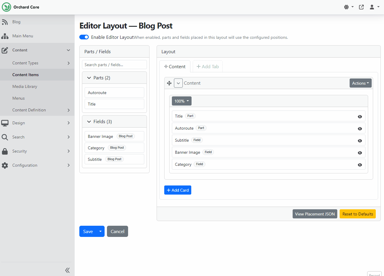
So, after adding this module to your Orchard Core web project as a project reference, we can set up our site. For the demo, we used the Blog recipe. Once our site is up, we need to enable the Editor Layout feature under Configuration -> Features. Let's try this out by modifying the content definition of the predefined Blog Post content type. To do that, we navigated to Content -> Content Definition -> Content Types, then clicked Edit next to the Blog Post content type. At the bottom of the content type editor, we will find a button labeled Editor Layout. Click on it and use the switch to enable the editor layout, which shows us a visual representation of what we can build in the editor.
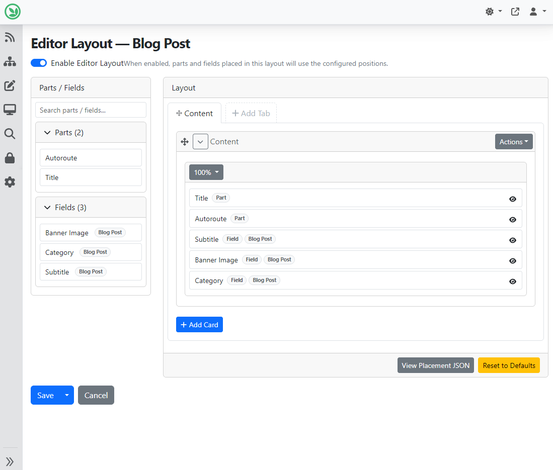
Here we can arrange our parts and fields:
- Add tabs to create tabbed sections on the editor.
- Add cards within a tab to group fields in a bordered card.
- Add columns within a tab or card to place fields side by side.
- Drag items from the Available Items sidebar into tabs, cards, or columns.
- Reorder items by dragging them within or between containers.
First, we added a new column to the Content card placed on the Content tab. It means we now have two columns in the Content card, and both columns will be set to 50% width by default to fill the space. But of course, we can change the width if we want. Once we have that, we move the Banner Image field to this new column inside the Content card.
We can also add new tabs by clicking on the Add Tab button. In the Add Tab modal, we can set the name of the new tab. We decided to move the Autoroute Part to the default Content card of this newly created Settings tab. We can easily do that by selecting the Autoroute on the left and dropping this into this card. Orchard will automatically notice that we have already used this part in the Content tab and remove it from there.
Save this editor layout and edit our predefined Blog Post content item to check how our new editor for this content type will look. As you can see, the blog post editor reflects the layout we set up.
And you can build a much more complex editor by using this feature! If you are curious about how you can do that, head to YouTube for a recording!
News from the community
Orchard Harvest 2026 Early Bird tickets!
We're excited to open registration for Orchard Harvest 2026!
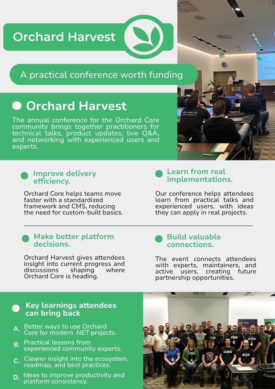
This year, we've also created a short "convince your boss" one-pager to help you make the case for attending. It highlights the practical takeaways, business value, and networking opportunities waiting at the event.
If you want to learn from real-world Orchard Core use cases, get a better sense of where the platform is heading, and connect with experts and active community members, this is for you. We'll be sharing this year's speakers and topics over time, so stay tuned!
Secure your spot today for the early bird pricing and get ready to level up your skills at Orchard Harvest!
Orchard Dojo Newsletter
Lombiq's Orchard Dojo Newsletter has 416 subscribers! We have started this newsletter to keep the Orchard community informed about the latest platform news. By subscribing to this newsletter, you will receive an email whenever a new post is published to Orchard Dojo, including 'This Week in Orchard', of course.
Do you know of other Orchard enthusiasts who would like to read our weekly articles? Tell them to subscribe here!