Orchard Core 1.1 release, Dynamic style Content Field - This week in Orchard (28/10/2021)
We are thrilled to announce that Orchard Core 1.1 is now available! Check out this post to know everything about the latest release of Orchard Core and see a demo about a great third-party Orchard Core module that provides a dynamic styling content field for Orchard Core! Let's get started!
Orchard Core updates
Add Media background checkerboard pattern for transparent images
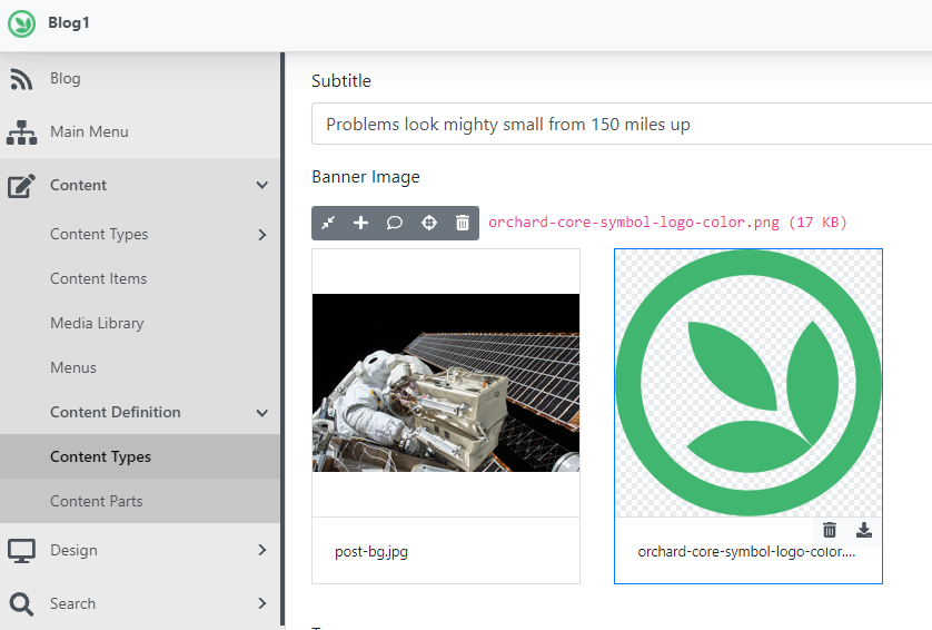
Let's say that you have a site set up with the Blog recipe and you want to change the Banner Image of the predefined blog post. It's a possible scenario that you upload a PNG or a GIF file that has transparency. But the transparency of the selected image couldn't be easily seen because the admin theme has no support to show that the given image has a transparent background. To fix this issue, now you will have a background checkerboard to easily see the transparent parts of the image, that works in dark mode too. Here you can see that we uploaded and selected an Orchard Core logo that has a transparent background.
Add Total support for Lucene API queries
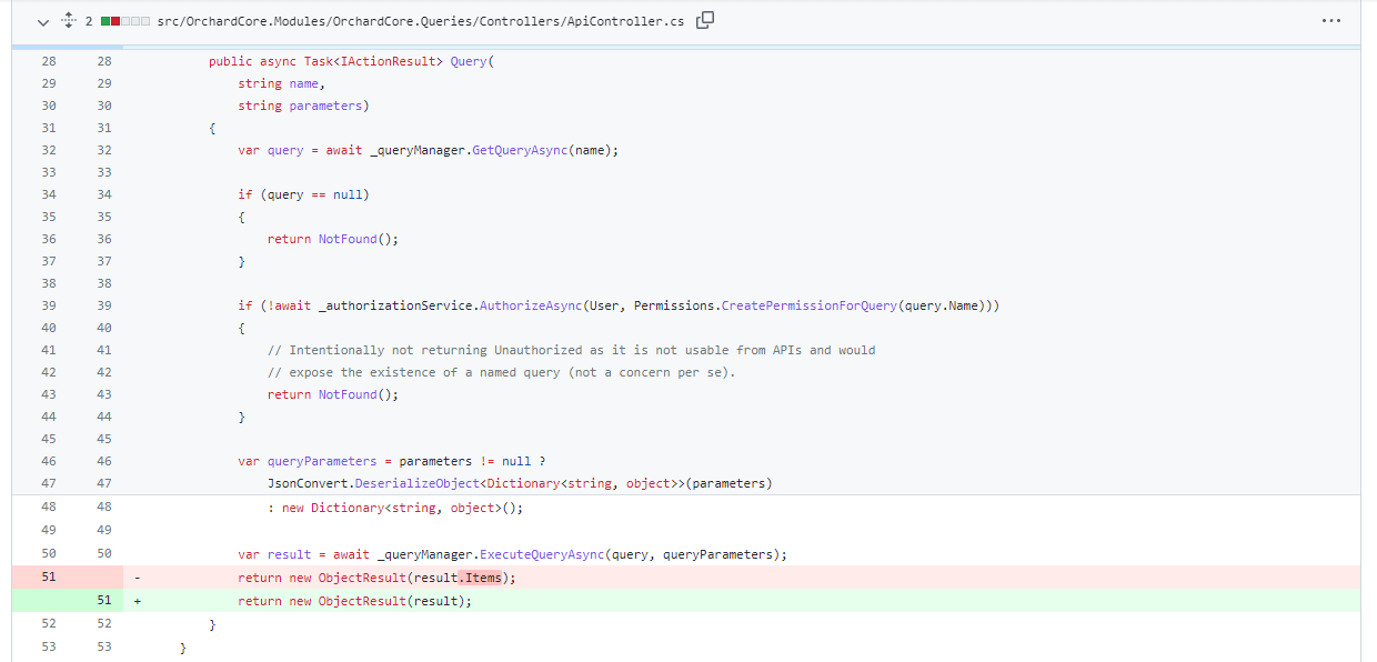
The change is just to return whatever the query object is returned from the query API, and it might contain more than what the interface exposes, which is just the items. For instance, Lucene can return the number, the total items. SQL won't do that because that's too costly.
Demos
Dynamic style Content Field
The ThisNetWorks.OrchardCore.Styles module provides a dynamic styling Content Field for Orchard Core. The repository contains a sample project which includes custom configurations for the CKEditor toolbar. In this demo, we will clone the mentioned repository and run the solution inside.
Set up your site using the Styles sample recipe that allows you to set up your site with additional pre-configured options, features, and settings out of the box.
First of all, let's navigate to Design -> Style Schemas. A style schema defines how the Styles field will be edited, and which components will be available. Open up the one called H2 Color.
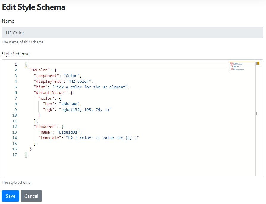
As you can see here, we defined a component schema. At its most basic a schema entry must contain a reference to a Vuejs component and the description of how to render its entry as CSS. The renderer can be either a renderer name, e.g., "renderer": "CssSizeEntry" or a LiquidJS template for more complex schemas. Here the template says that set the color of the h2 tags to the #8bc34a hex value. Before moving forward, let's check out the content definition of the Style Guide content type that comes from the Styles sample recipe as well (Content -> Content Definition -> Content Types -> Style Guide). As you may notice, this content type has three Style fields attached. Now let's focus on the one with the display name Heading 2.
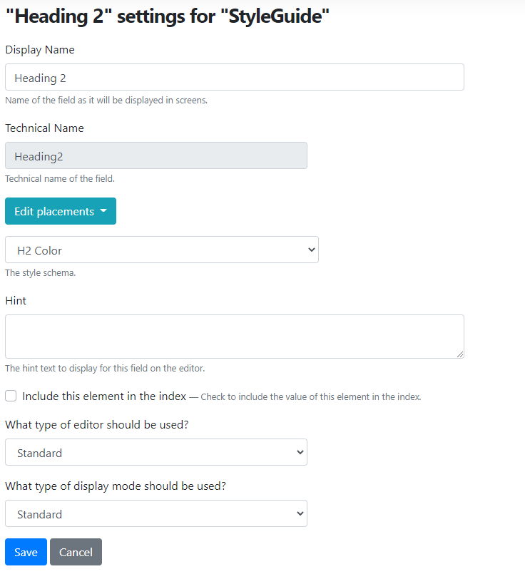
Every Style field can have a selected style schema (H2 Color in this case), or you can select the Custom schema option from the drop-down to say I don't want to use a given style schema, I would like to define the schema here for this Style field.
Now check out the predefined Style Guide content item. As you can see here, we have an h2 tag with the heading 2 text. And because we attached the H2 Color style schema with the Heading 2 Style field, when we render the content of this content item, the color of the text inside the h2 tag will be using the #8bc34a hex value.
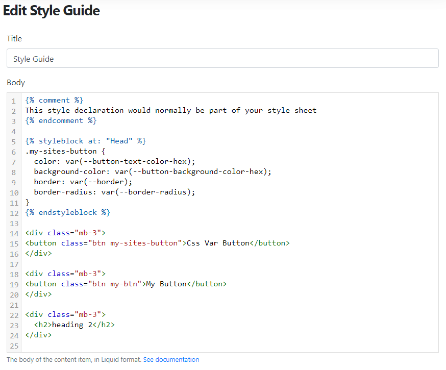
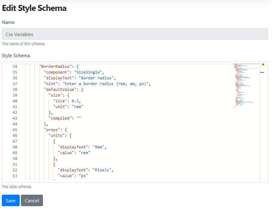
You can find other style schemas on the site, like the Css Variables one. Here you can see a range of CSS vars for the site. The BorderRadius adds rounded corners to the given elements. Here you can see we defined the value of the radius using rem. If you scroll back to the Style Guide content item, you will see that here we defined a my-sites-button class with a border value. The border-radius: var(--border-radius); means to use the defined BorderRadius value from a style schema. And here, you can see the usage of other variables from the style schemas like the button-background-color-hex, where you can easily say button-background-color-rgb as well if you defined the rgb value too. Here button is the name of the component, background-color is the name of the schema with a predefined hex and rgb colors.
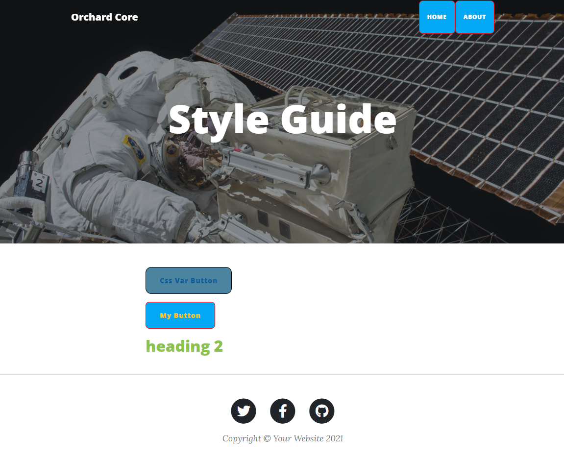
Now, if you open up the Style Guide content item, you will see something like this. Here you can see the color of heading 2, the border-radius of the buttons, and every other style that we defined using style schemas and attached them to our content type by using content fields. If you check out the README.md file of the repository, you will find nice, detailed documentation about the properties that you can use inside the schemas.
And as always, you can find a recording about this module on YouTube to see this feature in action!
News from the community
Orchard Core 1.1
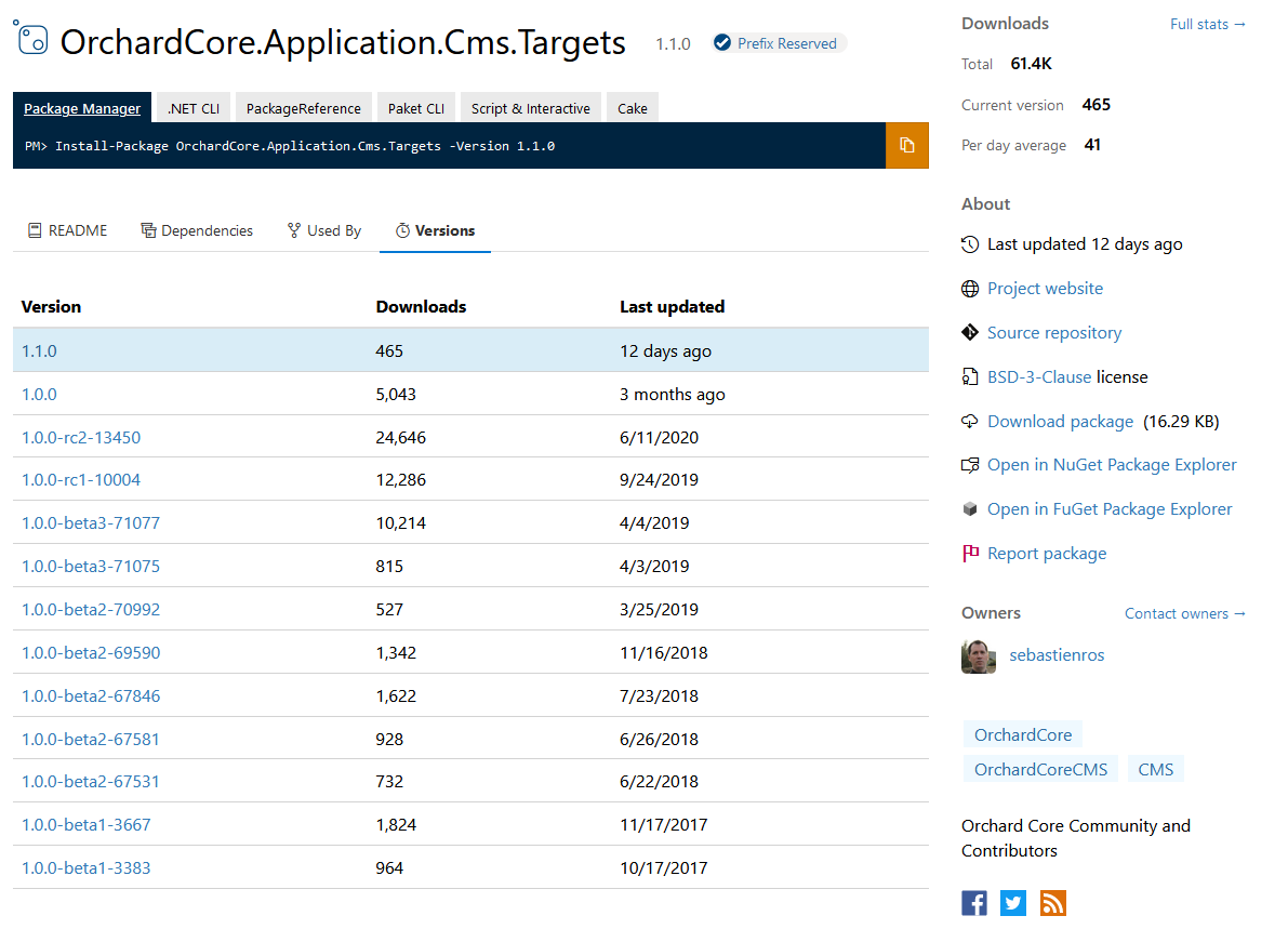
Orchard Core 1.1 is released! If you open up nuget.org and search for the OrchardCore.Application.Cms.Targets package, you will find the newest released version of Orchard Core! Upgrade your solution to 1.1 now! Feel free to drop on the dedicated Gitter chat or use the Discussions on GitHub and ask questions!
Reusable tests in Lombiq UI Testing Toolbox
The Lombiq UI Testing Toolbox is a web UI testing toolbox mostly for Orchard Core applications. Everything you need to do UI testing with Selenium for an Orchard app is here.
UI Testing here is an automation that clicks through the web application in a browser. One of the most popular frameworks for that is Selenium, which does exactly that. You get an API to instruct a browser, and every major browser is supported. This UI Testing Toolbox provides a lot of features on top of Selenium for Orchard Core. Basically allowing you to UI test an Orchard Core application in a safe and parallelized way providing a lot of helpers, a lot of higher-level APIs allowing you to test your application with SQLite, with SQL Server with local media storage, or with Azure Blob Storage. And you can have a test e-mail sent with a local SMTP server too. Everything just works. Check out the highlights of the Readme.md file of this repository to see all of the features! We had a demo about the UI Testing Toolbox a few weeks ago. If you haven't seen it yet, check out this This week in Orchard post!
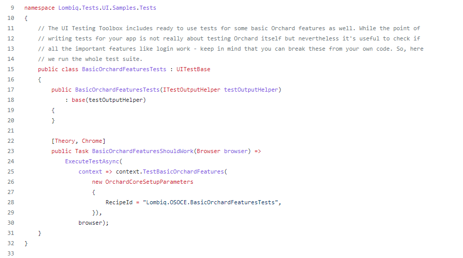
And the UI Testing Toolbox just got something very useful: Reusable tests to check that basic Orchard Core features work, like login, registration, and content management. Make sure your Orchard app's basics work! Check out the sample here!
Orchard Dojo Newsletter
Lombiq's Orchard Dojo Newsletter has 231 subscribers! We have started this newsletter to inform the community around Orchard with the latest news about the platform. By subscribing to this newsletter, you will get an e-mail whenever a new post is published to Orchard Dojo, including This week in Orchard of course.
Do you know of other Orchard enthusiasts who you think would like to read our weekly articles? Tell them to subscribe here!