Scheduling application, new branding assets - This week in Orchard (06/07/2021)
The new branding assets for Orchard Core are here! Check out our current post for a demo about a scheduling application, for the Auto Setup updates, and many more!
Orchard Core updates
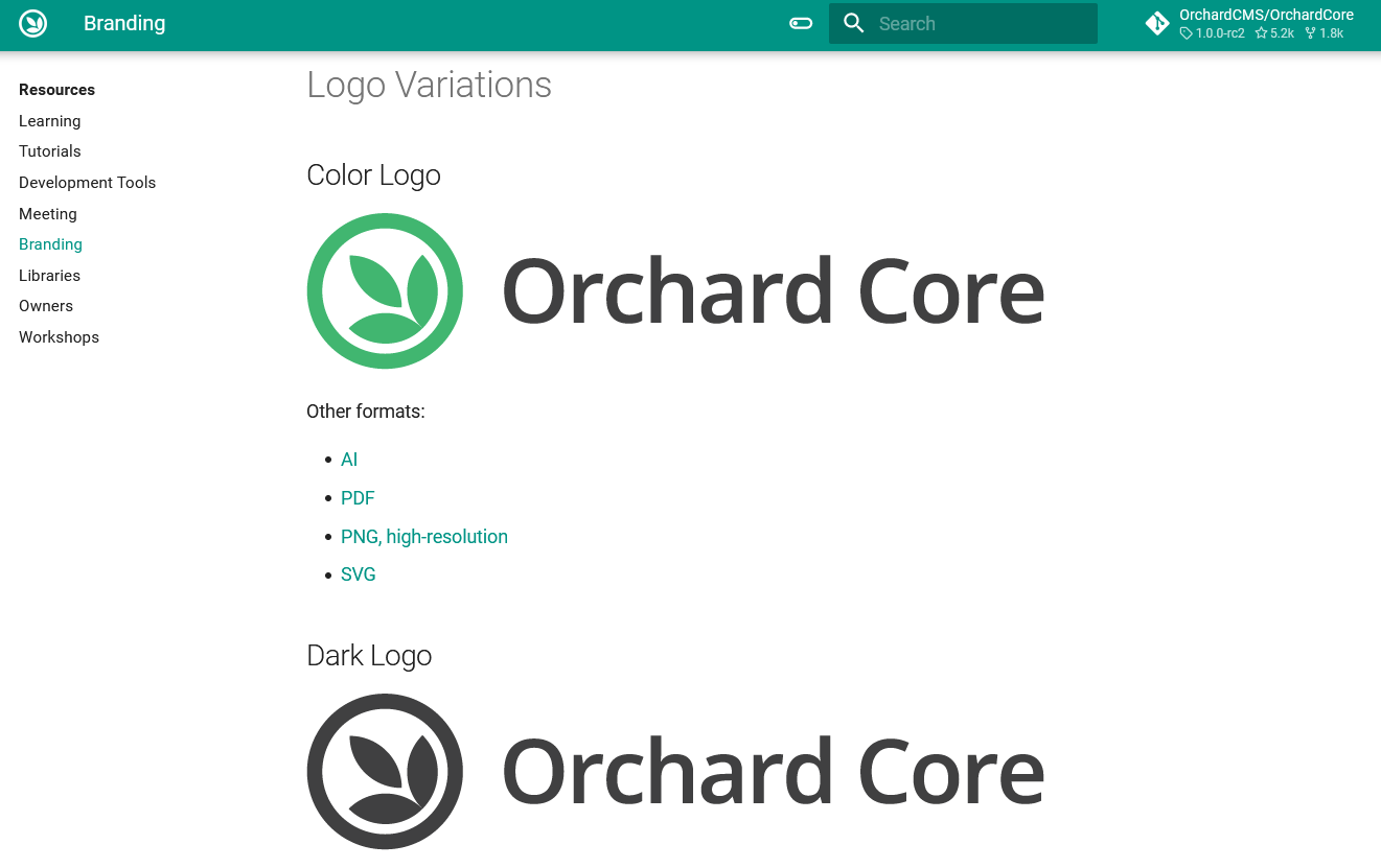
New branding assets
The issue was that we didn't really have concise branding guidelines or even proper branding assets. But the time has come, Orchard Core has now new branding assets! If you open up the Orchard Core Documentation, you will see the new icons and the new colors everywhere. If you click on the Resources option from the menu and select Branding from the left, you will find the updated guidelines and graphic assets for Orchard Core's branding. If you open up the admin UI of your site, you will see the new logo there too. When referring to Orchard Core, please use one of the logo variations without altering anything apart from the resolution (so don't change the colors, aspect ratio, graphics, or anything else).
Bootstrap 5 for the front-end themes
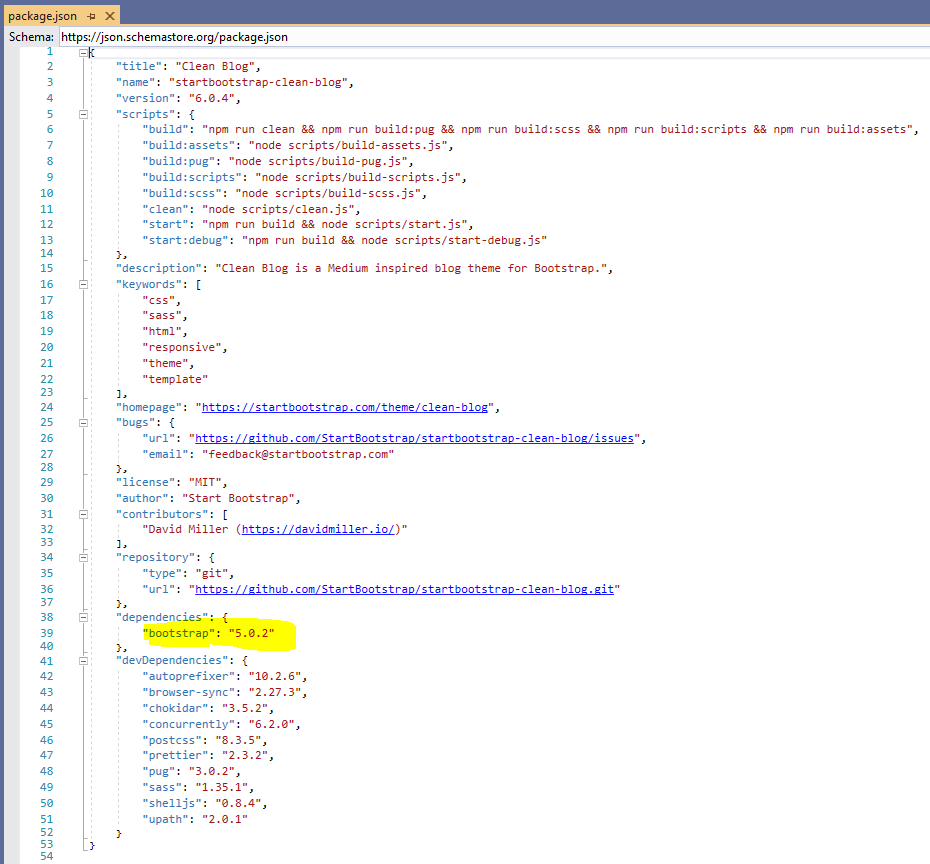
Orchard Core comes with some built-in front-end themes that you can use for your site. You can use a theme adapted for agency websites, a theme adapted for blogs, a landing page for a project that is under construction, and of course, the default Theme. When you use the latest preview source of Orchard Core you will notice that all of these now using Bootstrap 5, which means if you would like to use or customize them, you have the options to use the features that come from Bootstrap 5! Here is the content of the package.json file of the Blog theme.
Add DistributedLock for Multi-instance AutoSetup
It can happen that you have multiple deployments of Orchard Core, but you share the same database or the same Redis instance. Now you can see a new section in the documentation that explains how you can use the new optional distributed lock parameters like the LockTimeout or the LockExpiration. These help you to set the timeout in milliseconds to acquire a distributed auto-setup lock and the expiration in milliseconds of the distributed setup lock. 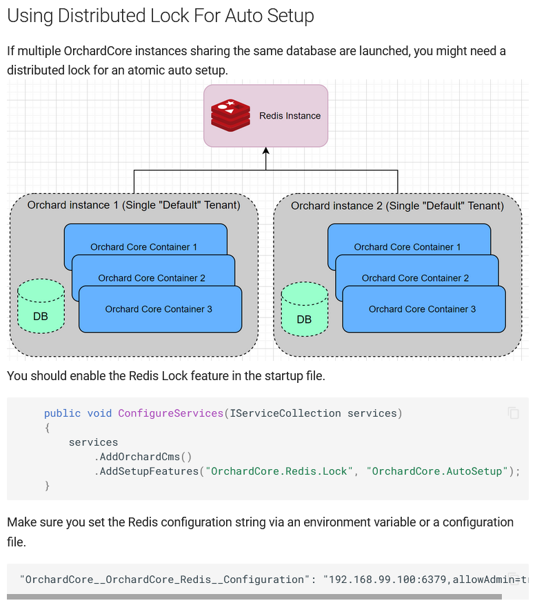
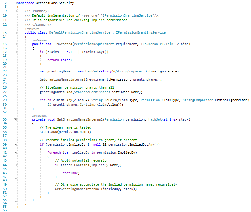
Check implied permissions
PermissionHandler should check ImpliedBy permissions. RolesPermissionsHandler doesn't have to check all user roles permissions, just Anonymous and Authenticated if applicable. RolesPermissionsHandler is scoped, so we can cache Anonymous and Authenticated permissions and not query them for each permission evaluation. Check out the default implementation of the IPermissionGrantingService interface, which evaluates if the specified PermissionRequirement is granted by provided claims.
Demos
Scheduling application
The StatCan Orchard Core repository houses a collection of custom Orchard Core resources, modules, and themes that support various web applications and software-as-a-service (SaaS) products. Built on top of Orchard Core CMS, developers have a suite of web application features out of the box (e.g., content management, authentication, forms, themes, etc.) by customizing the selection and configuration of components. The extensibility of the framework allows new features and components to be added easily. One of the custom modules called StatCan Scheduling provides types and utilities useful for scheduling appointments. Let's see that module in action!
First of all, let's run the solution and set up your site using the Vuetify platform theme recipe. The scheduling application and the Vuetify platform theme recipe are heavily built on the VueForms module that you can also find in this repository. If you haven't heard about it yet, you can open up This week in Orchard post from last year, where you can find a demo about this module.
The first thing that you will see is a calendar that you can use to add appointments to it. You can add a bunch of other calendars and employees to the system. Employees can be used to say that I would like to add an appointment to this calendar for this employee.
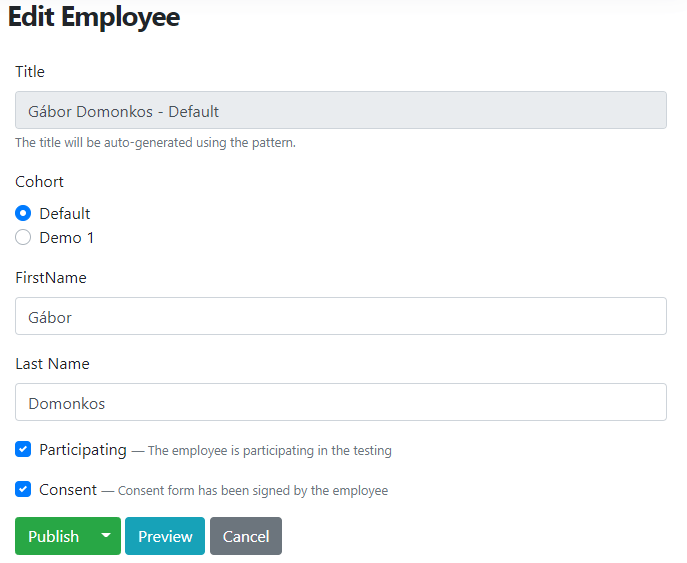
To be able to add an appointment, first, you need to add an employee to the system. It can be done using the admin UI of Orchard Core (Content -> Content Items -> New Employee). Let's say we would like to add an employee, and we assign this employee to the Default calendar.
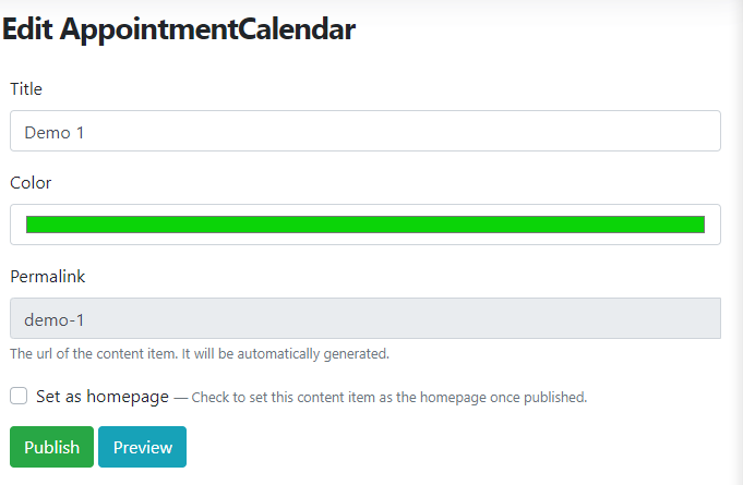
If you would like to add more than one calendar, you will find a taxonomy named Calendars. This has an AppointmentCalendar term content type. If you add a new AppointmentCalendar, you can specify its color, which will mean if you add a new appointment to this calendar, the color of the appointment will be used from here.
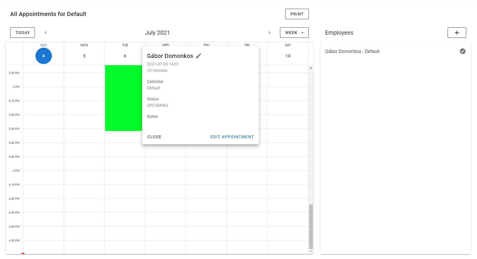
But without further ado, let's see the front-end if you add an appointment to this calendar using our newly created employee. As you can see, we have one appointment on July 6 for the employee Gábor Domonkos. The list of employees can be seen on the right, which contains only one employee right now. You have the option to edit the given appointment or employee just by clicking on the given appointment.
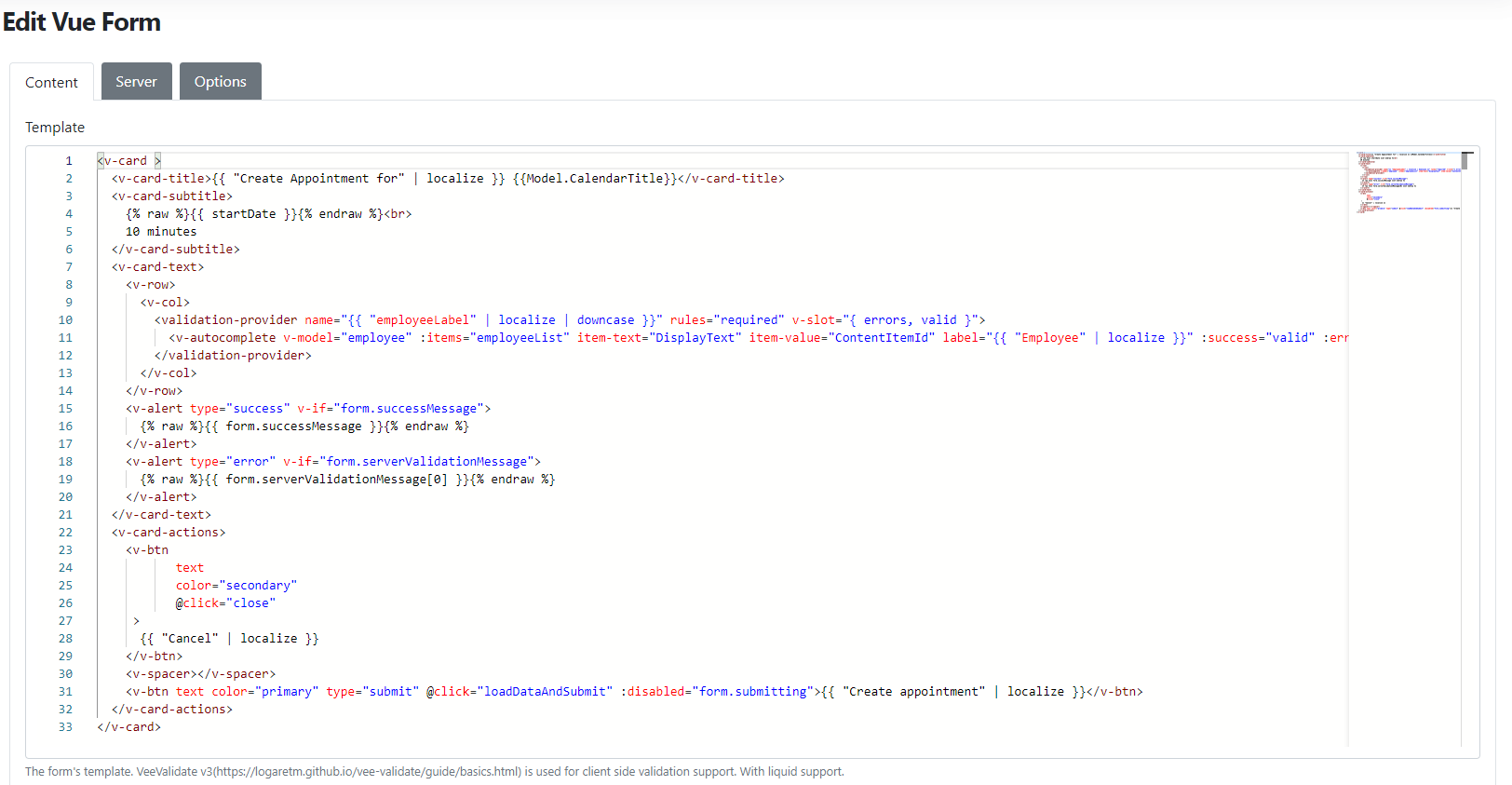
As we mentioned, this application is heavily built on the VueForms module that means if you navigate to Content -> Vue Forms, you will see a Vue Form content item called Create appointment, which is the component that is responsible for handling the appointment creation logic.
And we are just scratching the surface of this application here. If you would like to know more about it, head to YouTube now to see it in action!
News from the community
Lombiq Helpful Extensions: Helpful Content Types and Widgets
The Lombiq Helpful Extensions module is an Orchard Core module containing some handy extensions (e.g., filters for Projector). This time we will see the Helpful Widgets and Helpful Content types features.
The Helpful Widgets adds multiple helpful widget content types. These are basic widgets that are added by built-in Orchard Core recipes though in the case of using a custom setup recipe these can be added by this feature too.
Includes:
- ContainerWidget: Works as a container for further widgets. It has a FlowPart attached to it so it can contain additional widgets as well.
- HtmlWidget: Adds HTML editing and displaying capabilities using a WYSIWYG editor.
- LiquidWidget: Adds Liquid code editing and rendering capabilities.
The Helpful Content Types includes basic content types that are added by built-in Orchard Core recipes though in case of using a custom setup recipe these can be added by this feature too.
Includes:
- Page: Highly customizable page content type with FlowPart and AutoroutePart.
The only thing you have to do is to navigate to Configuration -> Features on the admin UI and enable the Helpful Content Types - Lombiq Helpful Extensions and Helpful Widgets - Lombiq Helpful Extensions modules.
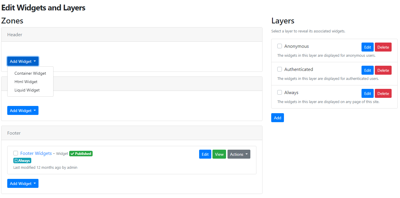
And as may you guess, if you would like to add a new widget in your zone, you will see the three mentioned widgets without the need of running the given recipes that contain the definition of those widgets.
Orchard Dojo Newsletter
Lombiq's Orchard Dojo Newsletter has 207 subscribers! We have started this newsletter to inform the community around Orchard with the latest news about the platform. By subscribing to this newsletter, you will get an e-mail whenever a new post is published to Orchard Dojo, including This week in Orchard of course.
Do you know of other Orchard enthusiasts who you think would like to read our weekly articles? Tell them to subscribe here!